2023
Domaine
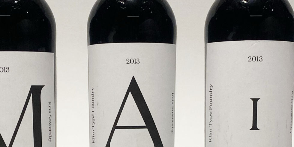
This is a typographic specimen for the Domaine typeface designed by Kris Sowersby, presented through a series of wine labels. Inspired by Domaine's origins in wine branding, the labels use only type to showcase its elegance and versatility, with seven front labels spelling “Domaine” and two back labels highlighting its defining features.
Type Design
Art Direction
Client /
Domaine
This project explores the Domaine typeface through an unconventional yet contextually relevant format: wine labels. Domaine, designed by Kris Sowersby, originated from a custom logotype he created for Hardy’s, a historic Australian wine company. The original lettering that inspired Sowersby featured striated forms and a complex double shadow, which he distilled into a refined, contemporary serif—Domaine.
To reflect its origin story, I designed a type specimen using only text, resisting the current trend of illustration-heavy or typeless wine labels. The front labels—seven in total—each feature a single letter, coming together to spell “Domaine” while individually showcasing the typeface in both display and text styles. The two back labels provide a deeper look at Domaine’s defining features, with one set in its display cut and the other in text. This approach celebrates the typeface’s elegance and function, directly linking form to origin.


